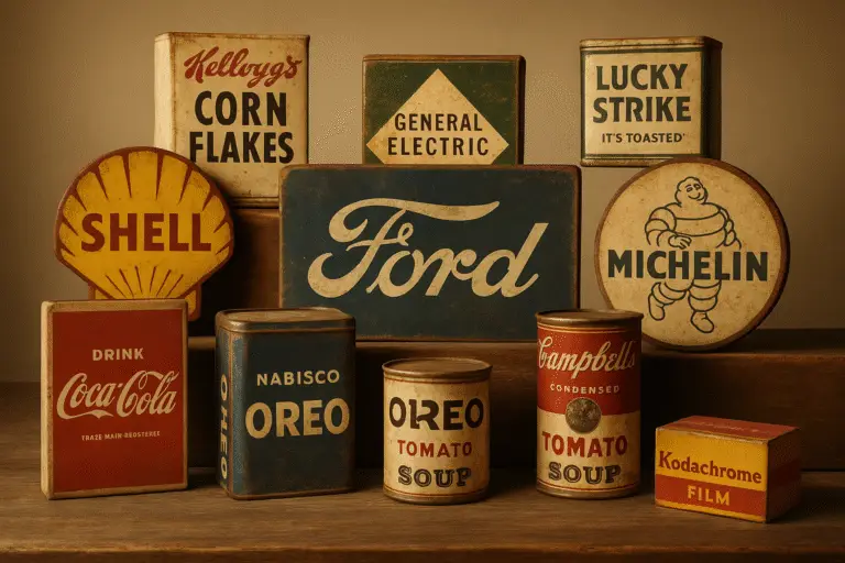
Brand logos are more than just visuals – they’re symbols of identity, heritage, and design evolution. This article highlights the stories behind ten iconic vintage logos, from Stella Artois to Apple, showing how they’ve balanced historical roots with modern relevance. Here’s a quick look at what makes these logos stand out:
- Stella Artois: A logo rooted in brewing history since 1366, featuring a horn and star symbolizing tradition.
- Twinings: The oldest unaltered logo, using elegant typography to evoke sophistication since 1706.
- Levi’s: The red tab, synonymous with durability and American fashion, remains a timeless mark.
- Louis Vuitton: Introduced in 1896, the “LV” monogram blends luxury and practicality.
- Heinz: The keystone shape links back to Pennsylvania’s heritage while maintaining a bold presence.
- Coca-Cola: Its flowing Spencerian script, created in the 1880s, has become a global icon.
- Ford: Evolving from ornate script to the recognizable blue oval, it reflects reliability.
- Shell: From a seashell importer to a global fuel brand, its scallop shell logo is unforgettable.
- McDonald’s: The golden arches, originally an architectural feature, became a global fast-food symbol.
- Apple: From a detailed Isaac Newton illustration to a sleek bitten apple, it embodies simplicity and innovation.
These logos show how timeless design and careful updates ensure brands stay relevant across generations. Each story reveals the balance between honoring origins and meeting modern demands.
15 Famous Logos That Looked VERY DIFFERENT Back Then
1. Stella Artois
The Stella Artois logo stands as one of the oldest company logos still in use today, with roots tracing back to the Den Hoorn brewery, first recognized in 1466. Its iconic horn and star elements date even further back, to 1366, showcasing a design steeped in history.
In 1926, when Stella Artois introduced its first beer as a Christmas gift, a star was incorporated into the logo. This addition reflected the beer’s name, Stella, meaning “star” in Latin, and celebrated the special occasion.
By 1930, the brand had solidified its visual identity, blending its historical elements into a unified design. As a wordmark-style logo, it managed to honor medieval brewing traditions while meeting the practical demands of early 20th-century branding.
Over the years, the logo has undergone subtle updates, but it has always stayed true to its origins. The horn and star remain constant, connecting modern consumers to nearly 700 years of brewing legacy.
Stella Artois demonstrates how a logo can evolve gracefully over centuries, preserving its heritage while adapting to the times. It’s a perfect example of timeless design, paving the way for the next iconic brand.
2. Twinings
Twinings has been around since 1706, when Thomas Twining opened a coffee house at 216 Strand in London. The logo, with its classic 18th-century script, has stayed true to its roots, featuring only slight updates over the years. Its design perfectly captures the charm and sophistication of the era.
The simplicity of the wordmark speaks volumes. Without relying on extra symbols or elaborate graphics, it conveys a sense of tradition and quality purely through its refined typography.
Even today, the Twinings logo is a familiar sight on tea packages, seamlessly connecting its rich history with modern tea culture.
3. Levi’s
Levi’s iconic red tab is more than just a decorative detail – it’s a symbol of the brand’s long-standing reputation for durability and quality. Originally rooted in practical workwear, Levi’s has grown into a cornerstone of American fashion, and the red tab has remained a constant, representing the brand’s dedication to authenticity and expert craftsmanship.
Placed on the right back pocket of their jeans, the red tab is instantly recognizable, serving as a nod to Levi’s rich history and its connection to generations of wearers.
Now, let’s look at another brand that has adapted its logo over time while preserving its legacy of excellence.
4. Louis Vuitton
The Louis Vuitton monogram is one of the most recognizable symbols of luxury worldwide. Originally designed in 1896 by Georges Vuitton, son of the brand’s founder Louis Vuitton, this iconic emblem was created as a practical solution to combat counterfeiting. Over 125 years later, it has become a global symbol of prestige and fine craftsmanship.
Georges Vuitton introduced the interlocking “LV” monogram, paired with decorative floral and geometric motifs, to protect the brand’s flat-topped trunks from being copied. What began as a security measure quickly turned into a hallmark of style, blending practicality with a striking visual identity. This innovation laid the groundwork for a logo that would come to represent luxury and heritage.
The monogram revolutionized luxury branding by making the logo the focal point of the product. At a time when branding was subtle, Louis Vuitton boldly embraced logo-centric marketing, paving the way for the “logo luxury” trend, where displaying the brand itself became part of the product’s appeal.
What sets the Louis Vuitton monogram apart is its timelessness. While many logos have undergone significant redesigns over the years, the “LV” has remained largely unchanged since its creation. This consistency has helped the brand build immense recognition and trust, reinforcing its exclusivity and status.
Its adaptability has also played a key role in its success. Whether adorning the original canvas trunks or modern handbags, wallets, and accessories, the monogram seamlessly fits a wide range of products without losing its distinctive charm. This flexibility has allowed Louis Vuitton to grow beyond its roots in luggage while maintaining a strong connection to its heritage.
Today, the monogram is more than just a logo. It’s a cultural icon. Its influence extends beyond fashion, appearing in art, music, and popular culture, further cementing its place in history. The Louis Vuitton monogram continues to embody the perfect blend of tradition and modern elegance, making it a symbol that resonates across generations.
5. Heinz
The Heinz logo is a proud nod to its Pennsylvania roots. Established by Henry J. Heinz in Sharpsburg, Pennsylvania, back in 1869, the company has consistently honored its origins. One of the most recognizable elements of its branding is the keystone shape, featured prominently on nearly every product.
Why the keystone? It’s a direct reference to Pennsylvania’s nickname, the “Keystone State.” This registered trademark not only celebrates the state’s historical importance but also reinforces the brand’s connection to its birthplace. By weaving this symbol into its packaging, Heinz ties its products to a sense of heritage and strength.
Over the years, the Heinz logo has evolved with care, balancing tradition and modernity. The original 1869 design was straightforward, bold red lettering on a clean white background. That classic look remained virtually untouched for nearly 100 years, reflecting the brand’s dedication to consistency.
In 1957, Heinz made its first major update, introducing an arched logotype in all caps. The custom typeface featured thick, straight lines with slightly pointed ends, giving the logo a commanding yet approachable feel.
By 1989, the logo underwent another transformation. The arched structure remained, but the design shifted to a more polished, modern look. A title-case inscription sat within a scarlet-red banner, with the letters slightly tilted to the right. This subtle tilt conveyed a sense of movement and warmth, aligning with the brand’s friendly and inviting image.
The scarlet-red banner became a defining feature, symbolizing Heinz’s passion and quality. Its geometric design, with an arched top and flat bottom, perfectly balanced the brand’s traditional values with a contemporary edge. This thoughtful design choice ensured the logo stayed relevant while maintaining its iconic identity.
Heinz’s ability to adapt its visual identity over time, without losing its essence, is a testament to its understanding of both its heritage and its audience. This careful evolution has kept the brand timeless while appealing to new generations, a balancing act that few brands achieve so seamlessly.
6. Coca-Cola
The Coca-Cola logo is one of the most recognizable symbols in the world, with roots stretching back to the late 19th century. It all began in Atlanta, Georgia, when Dr. John Stith Pemberton crafted a new beverage. The name “Coca-Cola” and its iconic script were the brainchild of his bookkeeper, Frank Mason Robinson.
Robinson chose the Spencerian script, a popular cursive style of the time, to give the brand a polished and memorable appearance. The design’s elegance lies in its balance – notice how the two capital C’s create a sense of symmetry, while the flowing curves add a touch of charm. Over the years, the logo has subtly evolved, but its timeless appeal has remained intact.
One of the most notable updates came in 1969 with the addition of the Dynamic Ribbon Device. This red wave element not only emphasized Coca-Cola’s signature color but also brought an energetic flair to the design. Through careful updates and strict design guidelines, Coca-Cola has ensured its logo stays consistent and instantly recognizable, whether it’s displayed on a billboard in Times Square or a soda can in a remote corner of the world. It’s a symbol that transcends language and connects with people everywhere.
7. Ford
The blue oval logo of the Ford Motor Company is one of the most iconic symbols in American automotive history. Since its founding in 1903 in Dearborn, Michigan, Ford’s branding has undergone a remarkable journey. Initially, the logo featured an intricate script style typical of the early 20th century. Over time, it transformed into the sleek blue oval we know today, representing reliability and forward-thinking in the automotive world.
This evolution happened alongside groundbreaking milestones like the introduction of the Model T and the revolutionary assembly line, which made cars more accessible to the average person. Today, the blue oval graces everything from rugged F-150 trucks to the legendary Mustang. It’s a lasting emblem of Ford’s innovative spirit and its role in shaping the automotive industry. The logo’s journey reflects the brand’s commitment to progress and excellence, much like the evolution of other vintage logos.
8. Shell
The iconic yellow and red scallop shell, a familiar sight at gas stations worldwide, has roots tracing back to the late 1800s. What began as a business importing seashells transformed into one of the most instantly recognizable symbols globally, thanks to a series of bold branding decisions.
The name “Shell” was inspired by Marcus Samuel Sr., who imported seashells from the Far East during the late 19th century. His sons later expanded the business into kerosene trading and adopted “Shell” as the brand name for the fuel they exported to Asia. By 1897, the Shell Transport and Trading Company had officially embraced this name.
The company’s first logo, trademarked in 1900, was a black-and-white mussel shell design. This trademark holds historical importance as the oldest among Shell’s extensive collection of over 22,000 trademarks. However, the mussel shell was not destined to remain the company’s emblem.
The shift to the scallop shell, or “Pecten”, came later. One popular theory credits the change to a businessman whose family coat of arms featured three scallop shells. By 1930, the scallop design had been formalized and began appearing on Shell’s packaging, signage, and vehicles.
In 1948, the logo evolved further to include the word “Shell” within the Pecten design. Then, in 1971, renowned industrial designer Raymond Loewy refined the look, placing the name below a sleeker, more modernized shell.
The brand’s signature yellow and red colors have been a constant since the early days. These colors were chosen to stand out and create a memorable visual identity. In the early 1990s, the palette received an update to enhance its appeal and maintain its relevance.
9. McDonald’s
The golden arches didn’t start as a logo. They began as a practical design feature for a single restaurant in the 1950s. Over time, they evolved into one of the most recognizable symbols in the world, representing fast food and a slice of American culture across the globe.
Richard and Maurice McDonald opened their first restaurant in 1940 in San Bernardino, California. Fast forward to the early 1950s, when architect Stanley Clark Meston incorporated two golden parabolic arches into the building’s design. These arches provided structural support and created a striking silhouette that could be seen from a distance.
Ray Kroc, the man who turned McDonald’s into a franchise empire, saw the marketing potential in these arches. As the brand expanded during the post-war highway boom, the arches became a defining feature, helping McDonald’s stand out in the growing fast-food landscape.
By 1961, the arches were redesigned into the iconic “M” shape we know today. The choice of yellow and gold wasn’t random – these colors were chosen for their warmth and high visibility, making them perfect for signage, packaging, and advertising. The simplified design ensured it was instantly recognizable, whether on a billboard or a burger wrapper.
During the 1960s and 1970s, the refined “M” became so iconic that it no longer needed any text to accompany it. The symbol alone was enough to identify the brand, no matter where you were in the world.
What’s fascinating about the golden arches is their origin. They came from architecture, not traditional logo design. This reflects a broader trend in 1950s American design, where functionality met bold visual appeal. Unlike logos that emerged from typography or abstract shapes, McDonald’s logo started as a three-dimensional structure and successfully transitioned into a two-dimensional global icon. It’s a transformation that highlights the inventive spirit behind many vintage logos featured in this article.
10. Apple
Apple’s logo journey is a fascinating shift from intricate detail to clean, iconic design. The company’s original logo, designed by co-founder Ronald Wayne in 1976, was highly detailed, depicting Isaac Newton under an apple tree. While artistic, it proved impractical for smaller scales or modern branding needs.
Recognizing this, Steve Jobs sought a more modern and scalable solution. In 1977, he hired graphic designer Rob Janoff, reportedly with a budget of $100,000, to create a new logo. Janoff’s creative process was refreshingly simple yet effective – he bought apples, studied their shapes for days, and refined the design into its now-famous form. The addition of a bite ensured it was unmistakably an apple and not mistaken for another round fruit. The bite also carried a subtle nod to the tech world, referencing the term “byte.”
The first iteration of the bitten apple logo featured rainbow stripes, a design choice that highlighted the Apple II’s groundbreaking ability to display color. As Janoff explained:
“The real solid reason for the stripes was that the Apple II was the first home or personal computer that could reproduce images on the monitor in color.” – Rob Janoff
Over time, the logo evolved alongside Apple’s design philosophy. In 1998, the company transitioned from the rainbow-striped version to a sleek, solid black logo. Later iterations included aqua and chrome finishes before settling on the flat, minimalist designs we see today. Each change mirrored broader design trends and Apple’s focus on elegant simplicity.
Beyond its clean aesthetic, Apple’s logo carries deeper symbolic interpretations. Former Apple executive Jean-Louis Gassée captured its layered meaning, saying:
“One of the deep mysteries to me is our logo, the symbol of lust and knowledge, bitten into, all crossed with the colors of the rainbow in the wrong order. You couldn’t dream of a more appropriate logo: lust, knowledge, hope, and anarchy.” – Jean-Louis Gassée
While urban legends have linked the logo to Alan Turing or biblical symbolism, Janoff has repeatedly debunked these theories. The design, created with remarkable speed, has stood the test of time, perfectly embodying Apple’s minimalist ethos and innovative spirit. This transformation reflects the timeless appeal seen in many vintage brand logos.
Logo Comparison Table
The evolution of logos reflects changing design philosophies and broader shifts in societal trends. Below is a table summarizing how some iconic brands have transformed their logos over time.
| Brand | Early Era | Original Design Features | Modern Era Description | Evolution | Significance |
|---|---|---|---|---|---|
| Stella Artois | Early heritage period | Medieval motifs and traditional typography | Contemporary design | Refined typography and simplified emblem | Combines historical roots with modern clarity |
| Twinings | Traditional design period | Classic text-based style | Updated iteration | Introduction of elegant script | Reflects premium quality and royal associations |
| Levi’s | Heritage illustration era | Detailed craftsmanship imagery | Iconic modern mark | Shift to signature mark | Balances legacy with clean, recognizable branding |
| Louis Vuitton | Ornate monogram period | Elaborate luxury monogram | Minimalist monogram design | Streamlined for versatility | Merges timeless luxury with modern adaptability |
| Heinz | Classic vintage period | Decorative typography | Cleaner, updated logo | Simplified for better legibility | Retains identity while embracing modern appeal |
| Coca‑Cola | Classic script era | Distinctive, flowing calligraphy | Subtly refined script | Preservation of signature elements | Ensures consistent global recognition |
| Ford | Detailed script era | Ornate typography with decorative framing | Bold, simplified emblem | Transition to clear blue oval | Updates legacy design for universal appeal |
| Shell | Realistic illustration era | Literal shell depiction | Abstract, stylized icon | Transformation to a recognized symbol | Establishes enduring identity through abstraction |
| McDonald’s | Early text-focused identity | Simple brand name design | Bold symbolic design | Introduction of golden arches | Evolved into a globally recognized icon |
| Apple | Detailed illustrative era | Intricate innovation-reflecting design | Minimalist modern icon | Shift to clean, bitten apple | Represents sleek sophistication and innovation |
The table highlights a common thread among these transformations: a move toward simplicity. Early logos often showcased intricate details and elaborate illustrations, but as branding adapted to digital platforms and global audiences, companies leaned into cleaner, more adaptable designs.
This shift wasn’t just aesthetic. Detailed logos that worked well in print often struggled to translate effectively in digital formats or at smaller sizes. As brands expanded globally, they needed symbols that could transcend language and cultural barriers. This led to a preference for abstract, streamlined designs that are easy to recognize and versatile across various mediums.
Each of these logo transformations tells a story of balancing tradition with modern needs. By simplifying their designs, these brands not only preserved their heritage but also ensured their logos could stand out in an increasingly digital and globalized world.
Conclusion
The vintage brand logos we’ve looked at highlight how visual identities have evolved over time. From Stella Artois’s medieval-inspired roots to Apple’s journey from intricate illustration to sleek simplicity, these logos reflect the delicate balancing act between honoring tradition and embracing modernity.
What makes these logos timeless is their ability to instantly convey values like quality, heritage, and trust. Coca-Cola’s iconic script, for instance, remains a symbol of consistency and nostalgia. Likewise, Louis Vuitton’s monogram, crafted in 1896, continues to represent luxury and exclusivity. These designs are visual storytellers, weaving a narrative that connects the past with the present.
The trend toward streamlined designs isn’t just about aesthetics; it’s a response to the demands of a global, digital-first world. Logos now need to function seamlessly across everything from websites to social media profiles. This shift shows how forward-thinking brands adapt to change rather than merely reacting to it.
These transformations also mirror broader societal changes. The move from ornate Victorian designs to clean, minimalist styles reflects shifts in architecture, fashion, and daily life. Each redesign captures the spirit of its era while staying true to the core identity that customers know and trust.
Studying vintage branding offers a fascinating glimpse into how design influences culture. Whether you’re drawn to the craftsmanship of early typography or the strategy behind modern logo updates, these stories reveal the blend of creativity and psychology that drives effective branding.
FAQs
Why do vintage brand logos still resonate in today’s digital era?
Vintage brand logos hold their ground in today’s digital era because they tap into nostalgia and create a strong emotional connection with consumers. These designs often carry a rich history and a sense of reliability, making them both memorable and relatable.
To stay relevant in a fast-paced, digital-focused world, many brands choose to refresh their vintage logos. By blending modern elements with the classic charm of their original designs, they strike a balance that keeps them distinctive in a competitive market while preserving the essence of their heritage. This approach allows them to remain meaningful and relevant to their audience.
What design features make vintage logos timeless and recognizable?
Vintage logos stand out for their enduring charm, largely due to a handful of distinctive design elements. One of the most notable features is the use of serif fonts, which lend a sense of tradition and history. These logos often adopt emblem-style layouts, emphasizing a connection to heritage and craftsmanship. Additionally, they frequently incorporate simple geometric shapes like circles, ovals, or shields, giving the design a bold and unified appearance.
Another defining trait is their muted or restrained color schemes, which contribute to a subtle, refined look. These carefully chosen elements work together to make vintage logos both memorable and relevant, even as trends come and go.
Why have vintage brand logos become simpler over time?
Over the years, vintage brand logos have shifted toward simpler designs to align with the needs of modern branding. Clean and minimal logos are not only more recognizable but also perform better across different platforms. This is especially crucial in digital spaces, where logos need to remain sharp and clear, even when scaled down to smaller sizes.
A simpler design also makes logos more versatile, allowing them to function seamlessly across a variety of mediums, from websites to product packaging. By embracing timeless and straightforward aesthetics, brands can preserve their identity while staying adaptable in a constantly evolving marketplace.